from shyft.time_series import point_interpretation_policy as fx_policy,statistics_property as stat_p
from shyft.time_series import Calendar,time,deltahours,TimeAxis,TimeSeries,TsVector,DoubleVector,IntVector
from shyft.hydrology.orchestration import plotting as splt
# demo partition_by and percentiles function
utc = Calendar()
t0 = utc.time(1930, 9, 1)
delta = deltahours(1)
n = utc.diff_units(t0, utc.time(2016, 9, 1), delta)
ta = TimeAxis(t0, delta, n)
# just generate some data that is alive
x = np.linspace(start=0.0,stop=np.pi*200,num=len(ta))
# increasing values
pattern_values = DoubleVector.from_numpy(500.0 + x*np.sin(x)+x/10+ 1000.0*np.random.normal(0,0.1,len(ta)))
src_ts = TimeSeries(ta=ta,
values=pattern_values,
point_fx=fx_policy.POINT_AVERAGE_VALUE)
# we want our percentiles to align to this particular time, for presentation
partition_t0 = utc.time(2016, 9, 1)
n_partitions = 80
partition_interval = Calendar.YEAR
# call .partition_by that does the magic of aligning using the time_shift function
# returns TsVector,
# where all TsVector[i].index_of(partition_t0)
# is equal to the index ix for which the TsVector[i].value(ix)
# correspond to start value of that particular partition.
# in short: moves the years to a common start-point that you specify, utilizing the time_shift function
# still-keeping a reference to the underlying time-series (no copy occurs, just mirroring)
#
ts_partitions = src_ts.partition_by(utc, t0, partition_interval, n_partitions, partition_t0)
# Now finally, try percentiles on the partitions that have the proper ts-vector size
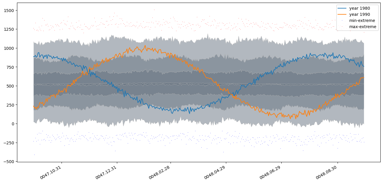
wanted_percentiles = [stat_p.MIN_EXTREME, 0, 10, 25, stat_p.AVERAGE, 50, 75, 90, 100,stat_p.MAX_EXTREME]
t0_view = utc.add(partition_t0, Calendar.MONTH, 1) # note to Eli; this is how we can present one year from 1.10
ta_percentiles = TimeAxis(t0_view, deltahours(24), 365) # this is the time-axis that we want aggregate on, day-average
p_result = ts_partitions.percentiles(ta_percentiles, wanted_percentiles)
# finally some plot, including one particular year (note the .average trick)
common_timestamps = [dt.datetime.utcfromtimestamp(p) for p in ta_percentiles.time_points][:-1]
fig, ax = plt.subplots(figsize=(16,8))
splt.set_calendar_formatter(utc)
h, ph = splt.plot_np_percentiles(common_timestamps,
[p.values for p in p_result[1:-1]], base_color=(0.4,0.45,0.5))
plt.plot(common_timestamps, ts_partitions[50].average(ta_percentiles).values, label='year 1980') # note the .average trick here
plt.plot(common_timestamps, ts_partitions[60].average(ta_percentiles).values, label='year 1990')
plt.plot(common_timestamps, p_result[0].values,'b,', label='min-extreme')
plt.plot(common_timestamps, p_result[-1].values,'r,', label='max-extreme')
plt.legend()